- Axiom’s Competitor-focused Headline
- Metomic’s Persona-oriented Logos
- Mintlify’s Wall of Love
- Raycast’s CTA Section
- Stripe’s Social Proof
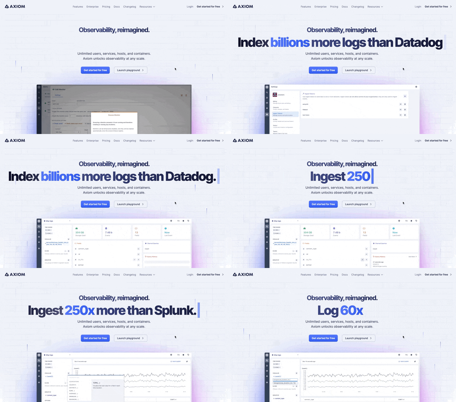
Axiom’s Competitor-focused Headline
In a crowded space, one common objection when landing on a home page is how your product differentiates from alternatives. Axiom puts it upfront. The ATF section stands out with a bold, explicit statement.
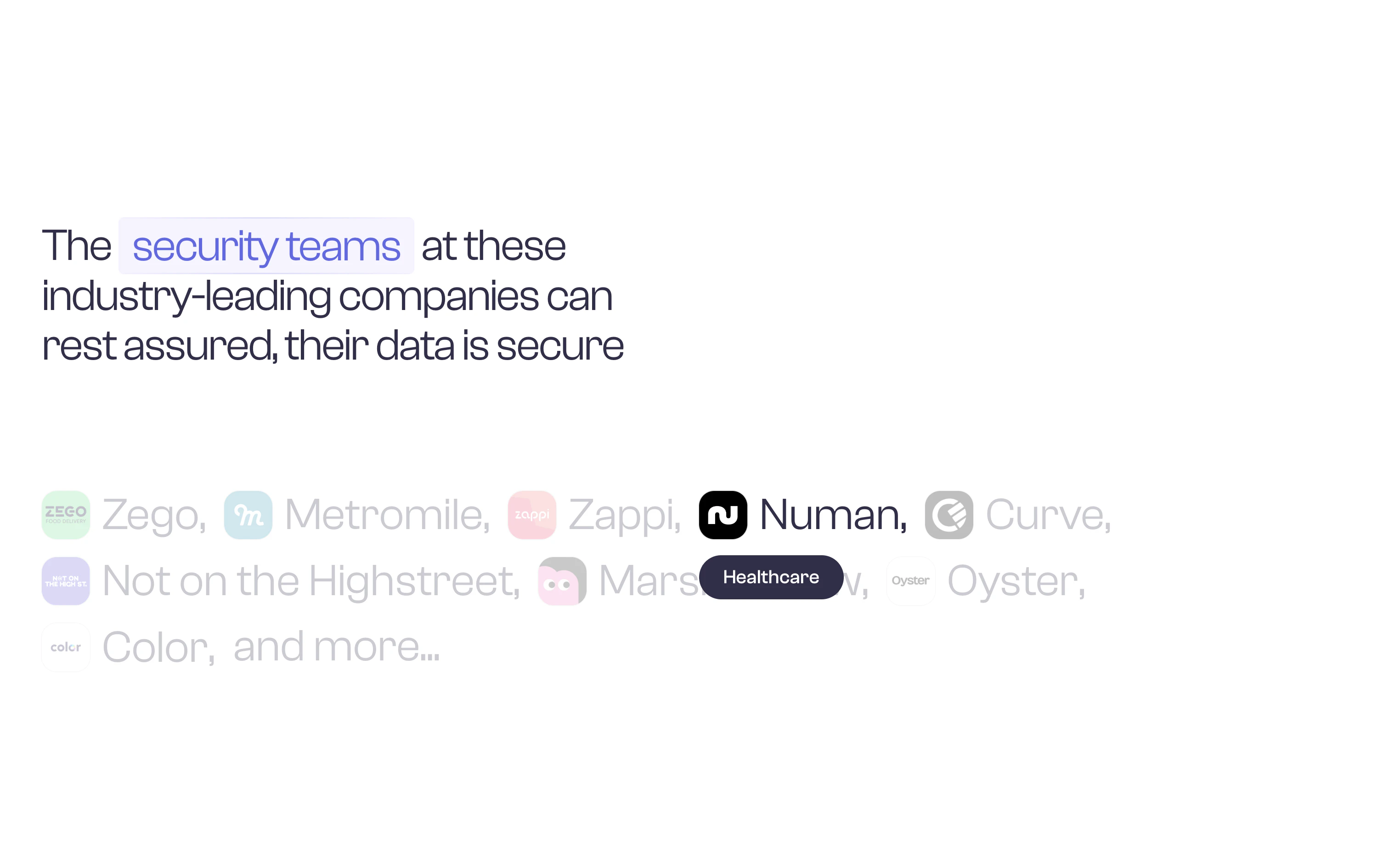
Metomic’s Persona-oriented Logos
Problem with logo clouds: You may not know them. As a workaround, Metomic’s logo cloud features customers and a short description of the companies.
Mintlify’s Wall of Love
When others highlight a few quotes from well-known companies, Mintlify lists an overwhelming number of testimonials. The objective? Make you feel that the product is loved by many.Raycast’s CTA Section
If you’re building a tool for devs, it can make more sense to have a command instead of a CTA button.
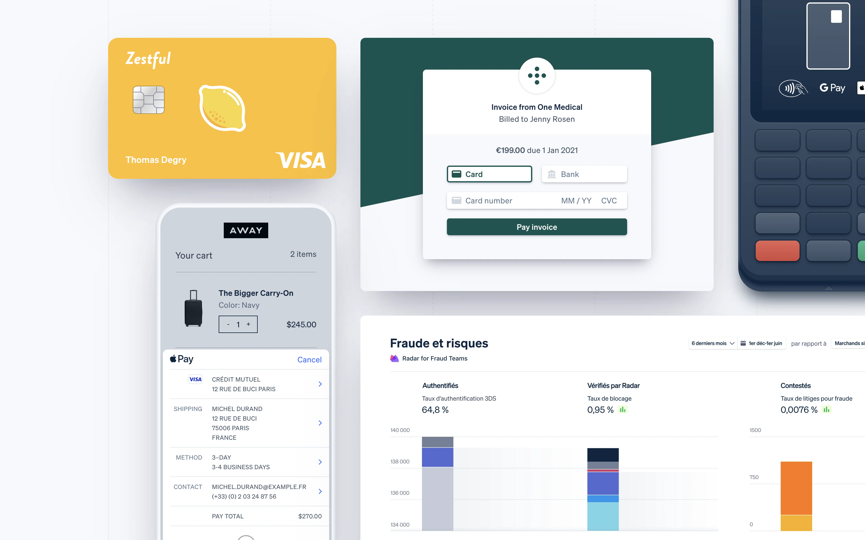
Stripe’s Social Proof
One common practice when building landing pages is to show the product. Problem: how do you show the product when you’re building an API that’s invisible by design? Take Stripe. As a workaround, it shows the end-user experience.